The moment a product does three things, its hardest problem stops being any of the three.
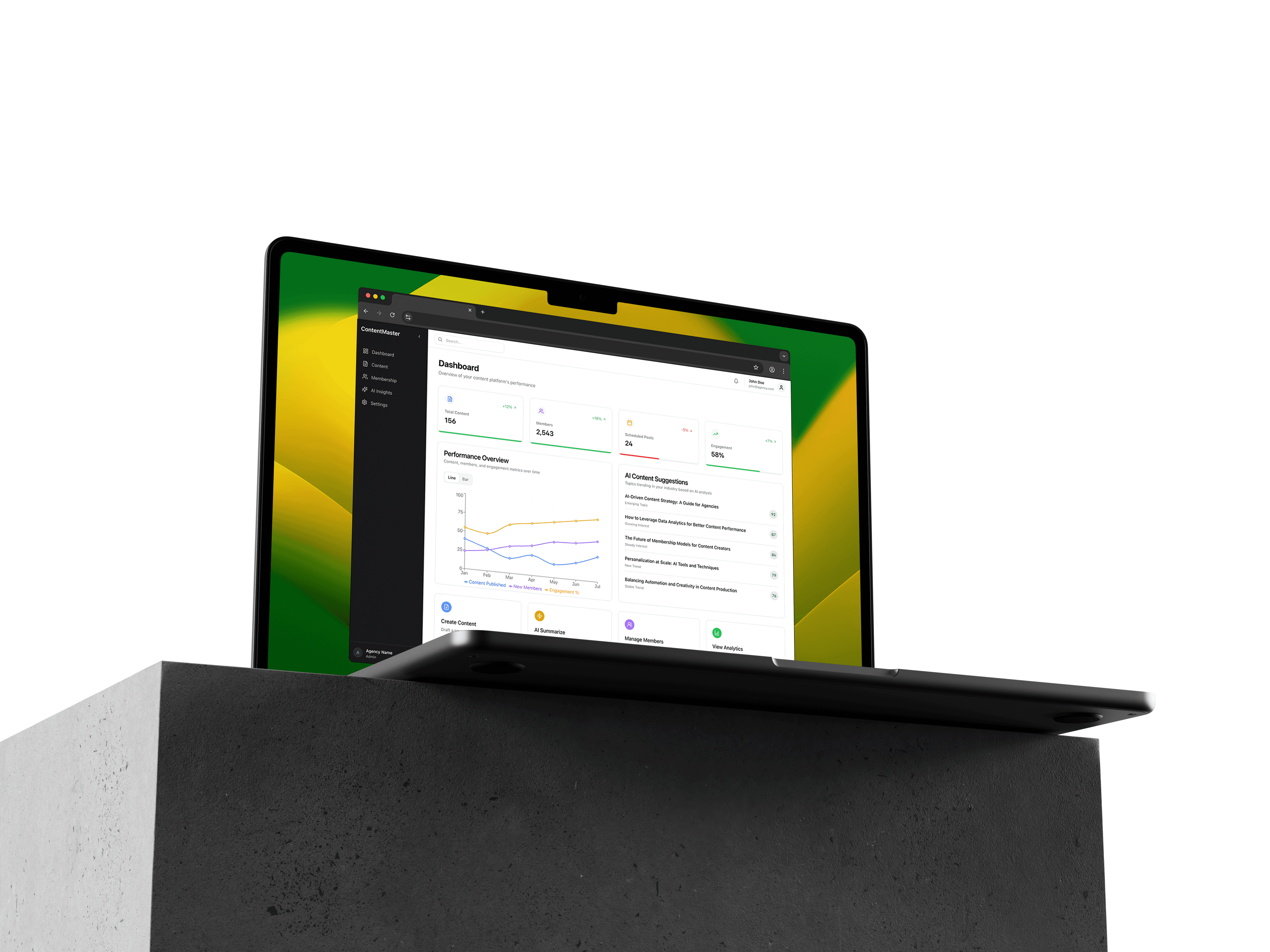
ContentMaster is a publishing platform for agencies and media teams. It manages content, runs paid membership tiers, and reads market trends. Those are three products. The design job was making them behave like one.
It did not start that way. The first version was a scheduling and publishing tool, which is a single coherent thing with an obvious shape. Working through the flows made it clear that agencies were not really asking how to publish on time. They wanted to know what to publish so that people would pay for it, and they wanted to sell it under their own name. Answering both pulled two more products into the scope, and the interesting problems arrived with them.
The Bolted-On Feeling: Suites usually read as separate applications sharing a login. Different densities, different rhythms, different words for the same object, and the user pays the tax at every crossing.
Two Users Doing Unrelated Jobs: A content strategist plans a quarter of output. A commercial lead watches subscription tiers convert. They sit in the same organisation, use the same product, and share almost no screens.
The Navigation Tax: Every capability added to a top-level nav makes the nav a worse description of the product. Five tabs of equal weight tell the user nothing about what this software is for.
What makes a suite feel like one product is a shared object, not a shared menu
The tempting fix is navigational: put everything behind one sidebar, apply one visual style, call it unified. That produces consistency and does nothing about the seams, because the user still crosses a border every time they change task.
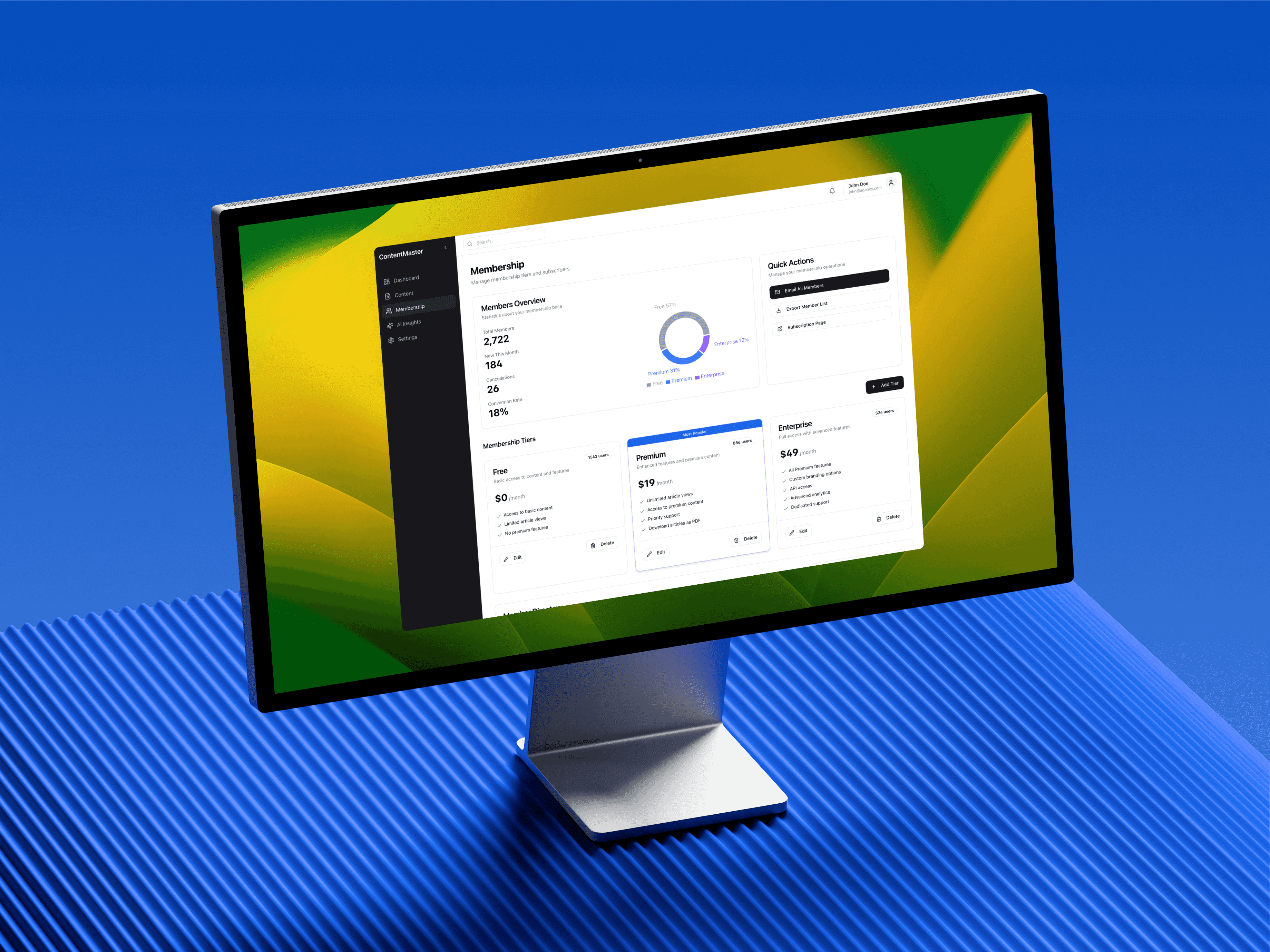
What holds the three halves together here is that they are all descriptions of the same object. A piece of content is a thing to schedule, a thing sitting behind a membership tier, and a data point in what is trending. Those are three views of one item rather than three items that happen to be nearby.
Once that was the model, the design work became keeping the vocabulary identical across the views. The same status pill, the same category label, the same title treatment, so that moving between planning and monetisation feels like turning an object over rather than opening another app.
One frame, so switching context does not feel like switching product
The interface keeps a persistent dark sidebar against a light workspace. That contrast is doing structural work: the dark rail is the part that never changes, and everything that does change happens inside the same bright panel.
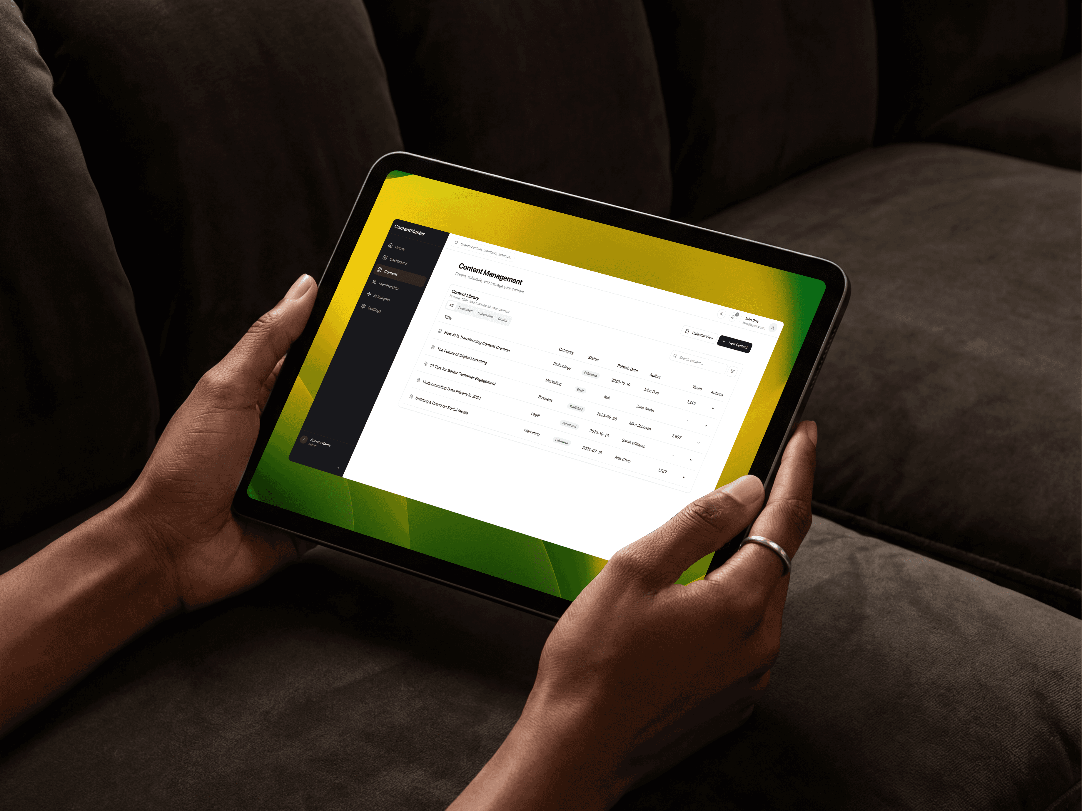
Data presentation had to be deliberately plain for the same reason. Membership distribution uses flat colour blocking rather than gradients, and the content library strips table borders back to whitespace and status pills. The point is not minimalism for its own sake. It is that a strategist and a commercial lead are reading very different numbers, and if each area invents its own visual language the product fragments along exactly the line I was trying to hide.
A seam handled properly: calendar and list are the same data
Editorial planning wants a calendar. Auditing what exists wants a table. Most products pick one and make the other a poor relation, or build two features that drift apart.
Here it is one toggle over one data set. Calendar for placing things in time, list for interrogating status and history. Nothing is available in one and missing from the other, which is what stops the toggle becoming a decision the user has to think about.
The white-label layer sits underneath all of this and constrains it further. An agency sets its own primary and accent colours, which means no part of the interface can depend on a specific hue to communicate. Anything carrying meaning has to work when someone chooses a colour I would never have picked, so the base layers stay neutral and the client palette is allowed to sit on top without touching legibility.
Where the seam still shows
Trend intelligence never fully joined the rest. Scheduling and memberships are both about content the team owns. Trends are about the outside world, they arrive on a different clock, and no amount of shared styling makes a market signal feel like the same kind of object as next Tuesday's post.
I would now treat that as a legitimate boundary rather than a failure of integration. Some parts of a product should feel different because they are different, and forcing the join is how you get a suite that is uniformly bland instead of coherent. Knowing which seams to hide and which to leave visible is the part I would think harder about at the start.
The honest status: ContentMaster is designed and was never deployed. It is a complete interface with nothing running behind it, so there is nothing to click and no agency has used it. The claim that shared objects hold a suite together is reasoning from how the work fits, not a finding from anybody's workflow.