
IdeaOps started with a question nobody had a clean answer to: why does building software still require three different people working in three different tools that never talk to each other?
Designers in Figma. Developers in VS Code. Product managers in Notion. The handoff between each is where time dies, turning a meeting note into a Jira ticket, a static frame into Swift code, a decision into documentation. None of it is the actual work. It's the tax on the work.
When we started auditing high-velocity product teams, we found that around 40% of what people called "working" was really just translating things between tools. That number was hard to ignore.
The Silo Problem: Every role had its own surface, its own language, its own mental model. Collaboration meant context-switching, not shared context.
The Translation Penalty: A designer's annotation becomes a PM's ticket becomes a developer's task. Each conversion loses something and introduces something that wasn't there.
Dashboard Fatigue: Traditional SaaS assumes you'll go to it. Nobody wants another destination. They want something that fits around how they already think.
The first design question was about roles, not features
Before touching any UI, we spent time mapping what different people in a product team actually needed moment to moment. Not their job descriptions, their actual decisions. What does a designer need at 9am on a sprint day? What does a developer need at 3pm when a requirement changes? What does a PM need immediately after a stakeholder call?
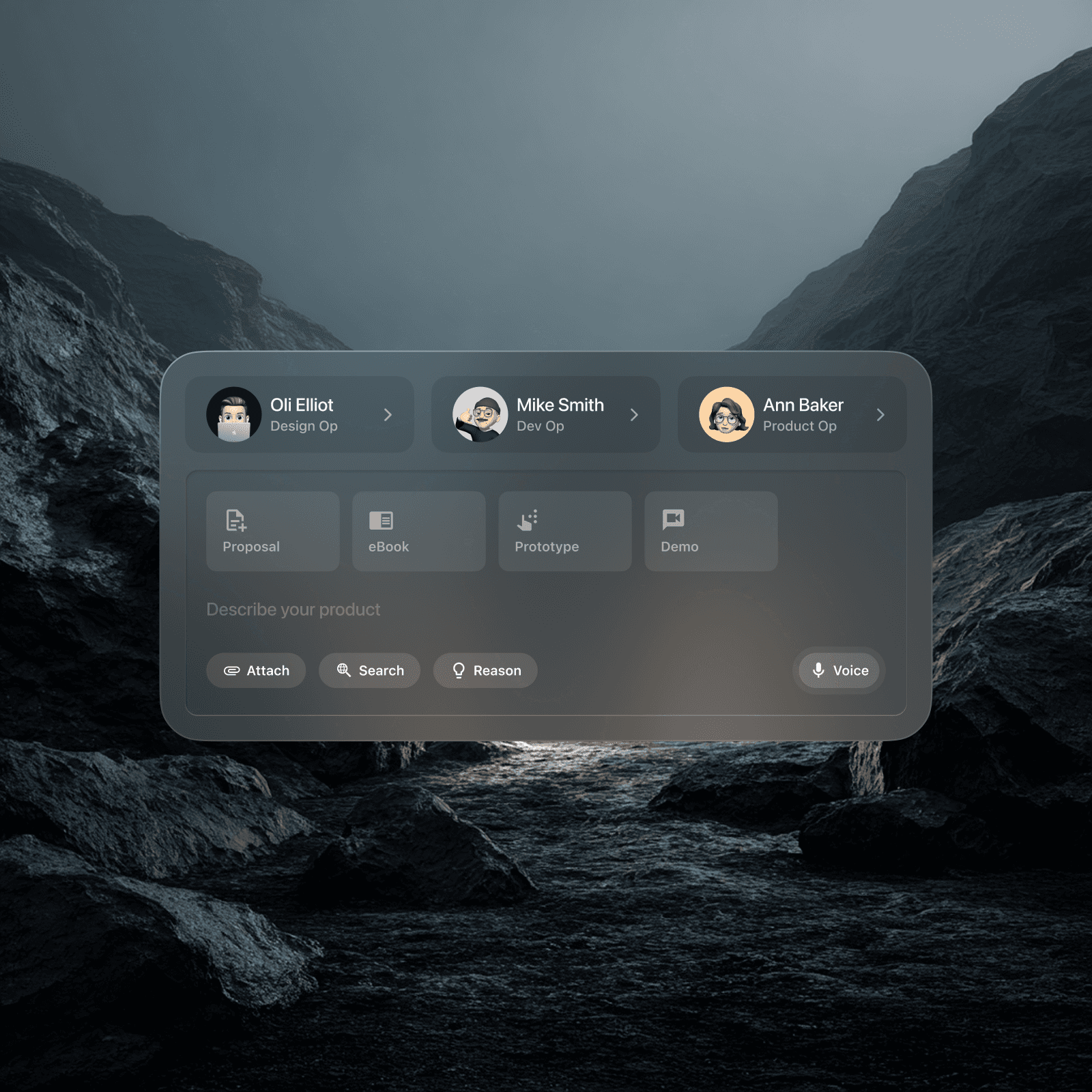
Three distinct modes emerged: Design Ops, Dev Ops, Product Ops. Not different apps, different lenses on the same system. The same input, the same surface, but the AI interprets and routes based on who's asking. Oli Elliot as Design Op. Mike Smith as Dev Op. Ann Baker as Product Op. Real names, real role distinctions, built into the persona framework from day one.
That role-switching mechanic, a floating selector panel with avatar, name, and role, became the first thing we designed. It's the entry point into the system. Get that wrong and the whole concept collapses.
The visual language had to feel like an OS, not an app
Early explorations looked like every other SaaS dashboard: sidebar nav, tables, cards in a grid. It was organised but it was wrong. An OS doesn't live on a page, it lives on top of everything else.
We moved to a floating, glassmorphic architecture. Dark backgrounds with heavy blur layers. Cards that sit in perceived 3D space, grounded by multi-layered shadows and subtle inner borders. The role selector we'd designed first became the template for every panel in the system, compact, legible, floating.
Colour was used functionally, not decoratively. Cyan for Dev Op states. Blue for Product Op. The palette only activates when something is active, otherwise the interface stays near-black and neutral, so the user's actual work stays visually dominant.
Typography was kept strictly utilitarian, Inter throughout, because the backgrounds are complex and variable. Anything decorative would fight for attention against the blur layers.
The first real prototype looked like what we were trying to replace
We built a working dashboard, sidebar navigation, tables, structured views. It was clean. Testers hated it. Not because it was broken, but because it was familiar in exactly the wrong way. Power users told us directly: they didn't want to go somewhere to do things. They wanted to trigger things from wherever they already were.
That feedback led to the hardest call on the project: scrapping the dashboard entirely. No sidebar. No destination pages. Just a Command-K style input bar, the Omni-Bar, that combined text, voice dictation, and file attachment into one component. Triggers and Actions replaced navigation menus.
The clearest example of this working in practice: the ambient meeting recording flow. The AI listens to a stakeholder conversation in real time, categorises the audio into compliance requirements, risk flags, and linked resources, and surfaces them as structured blocks, without the user touching a menu once. The interface earns its keep by disappearing.
The split-view coding environment was the hardest screen to get right
The Dev Op mode needed to show code and a live preview simultaneously. As SwiftUI logic is typed, the system generates an interactive mobile preview in real time. Natural language can refine it, type "add a search filter" and the correct code block is injected. That sounds straightforward until you're trying to split a 13-inch screen between a code editor, a live preview, and a floating command interface without any of them feeling cramped.
We went through multiple layout configurations before landing on a true split, editor left, preview right, Omni-Bar floating above both. The key was making the Omni-Bar feel like it belongs to neither panel. It's above the work, not part of it.
What we learned: simpler UI means harder backend
Stripping the interface down to a single input bar felt like simplification. It wasn't, it pushed enormous complexity into the AI layer. Without menus or structured navigation to constrain intent, the system has to interpret what the user means with extreme accuracy. A small ambiguity that a UI would have caught now becomes an AI inference problem.
That tradeoff was worth it. Around 12 hours saved per product manager per week. Time-to-prototype dropped by 70%. But it also meant that every word of every prompt had to be tested against real user behaviour, not assumed to be self-evident.
The next frontier is AR, taking the OS off the desktop entirely and into native spatial computing. The glassmorphic cards that float on a dark background are already halfway there.