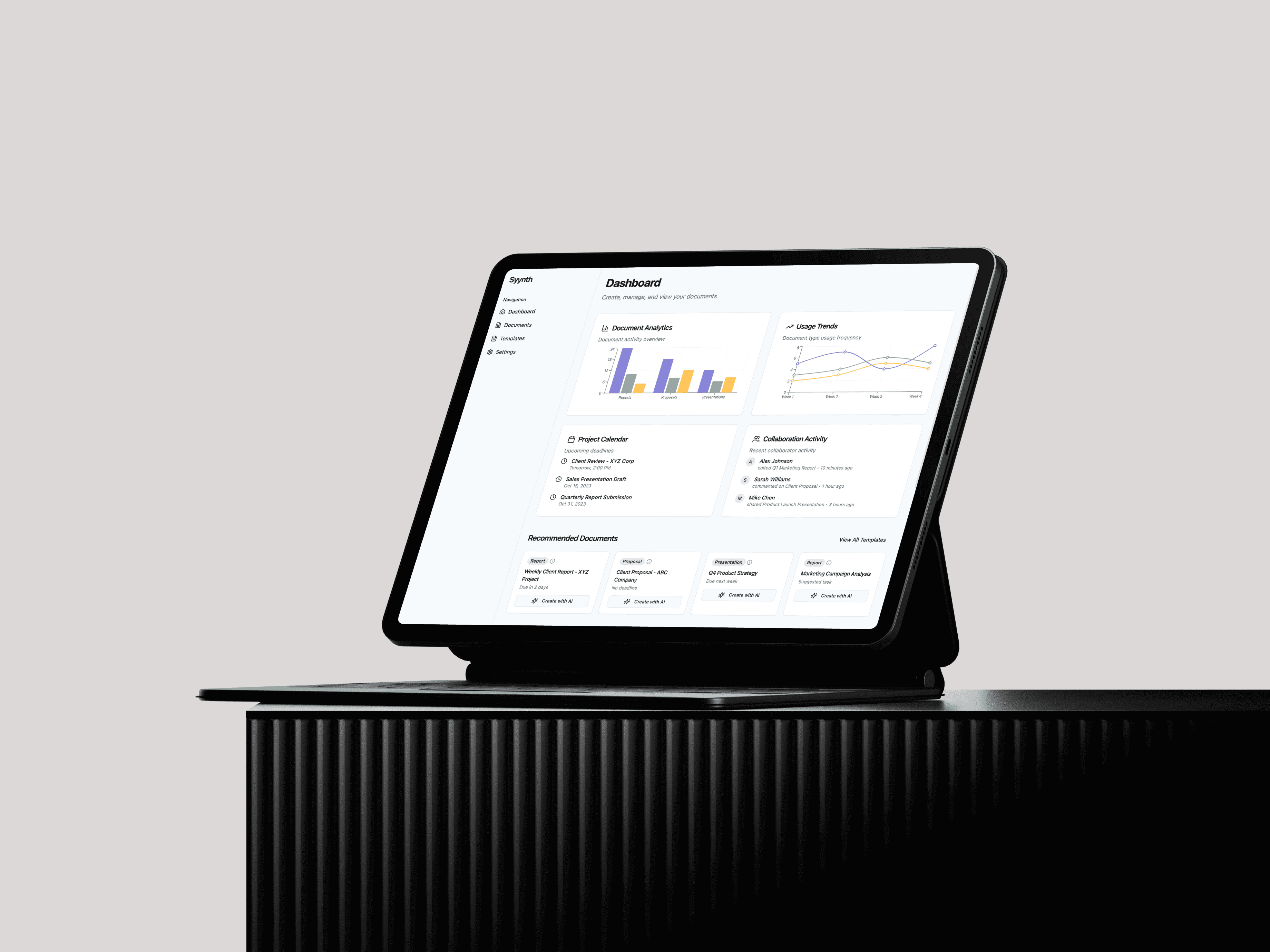
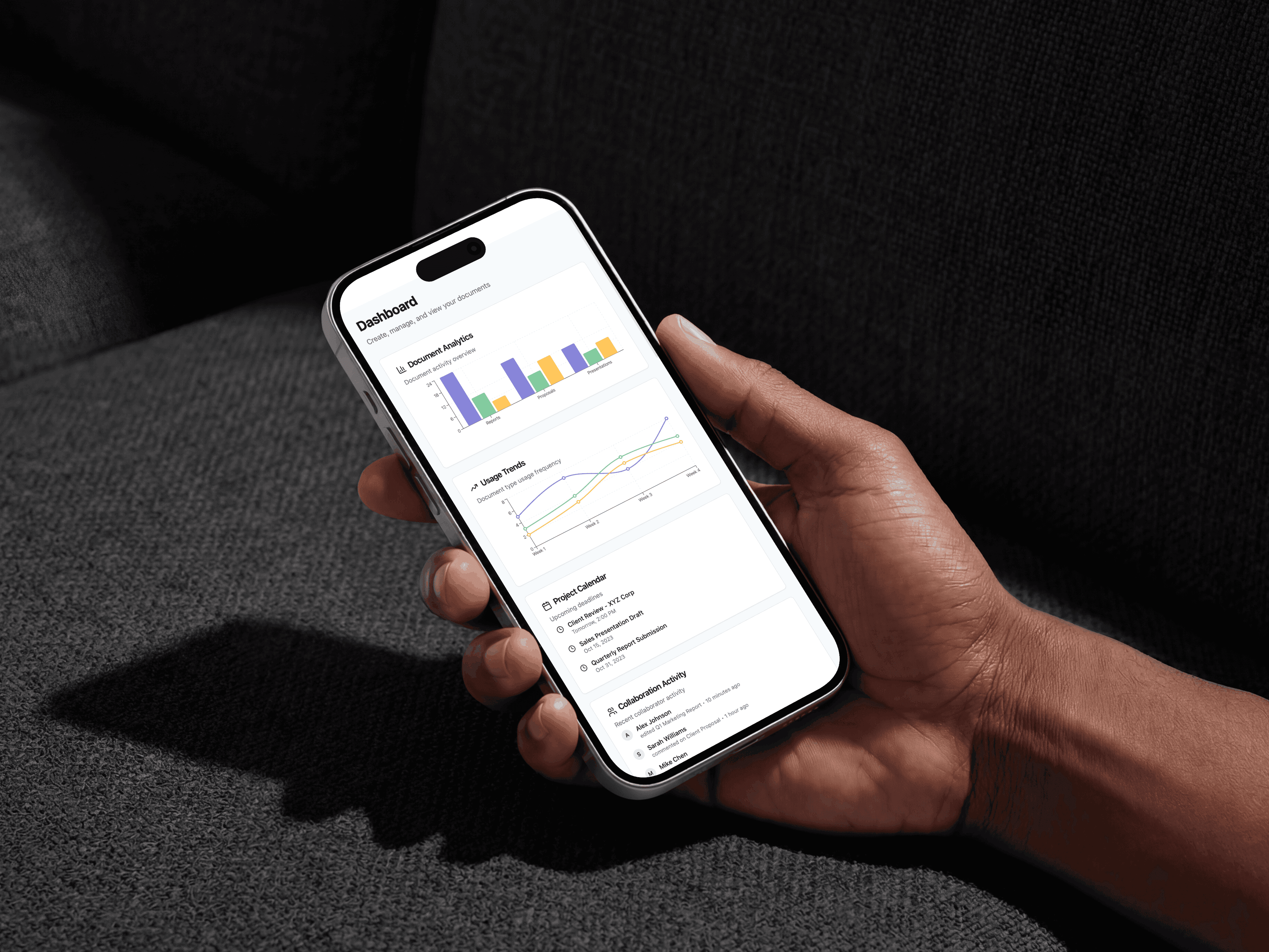
Syynth is a reporting platform for strategy and ops teams. It tackles the gap between looking at a data dashboard and writing the summary that has to come after it. Instead of manually reading charts and formatting a weekly report, the platform drafts it. The interface connects the analytics view to an AI authoring layer, where the system surfaces the narrative and the user refines it.
Year
02.25
Scope
Rapid Prototyping, Admin Automation
Timeline
2 weeks
The Challenge & Insights Gathering
Creating a platform that produces high-level strategic documents required understanding the friction points of traditional business reporting. Discovery Workshops & Stakeholder Interviews We audited the weekly workflows of strategy directors and operations managers. A critical bottleneck was identified: teams were spending hours staring at analytics dashboards, manually extracting data, and formatting it into static weekly reports, often missing the "so what?" in the process. The objective became engineering a workspace that doesn't just format text, but actually acts as a junior analyst—reading the underlying data and proactively surfacing the critical narratives before the user even begins to type.

Defining the Ecosystem: Personas & Roles
To structure the complex relationship between analytics, document generation, and team collaboration, we defined three core user archetypes.

Marcus Webb
Active-Duty Infantry
Monthly subscriber, auto-reorders his bag. Earns recognition, not rewards.
Monthly Subscriber
Auto-Reorder
Merch Buyer

Lena Carr
Veteran & Firefighter
Buys for her crew. Expects double points as a service member — no questions asked.
Veteran Verified
Group Orders
Reserve Roasts
🤖
Tyler Rosch
Civilian Fan
Found BRCC through social. Driven by challenges and levelling up his rank.
Challenge Hunter
New Roasts
Squad Member
Iteration & Strategic Pivoting
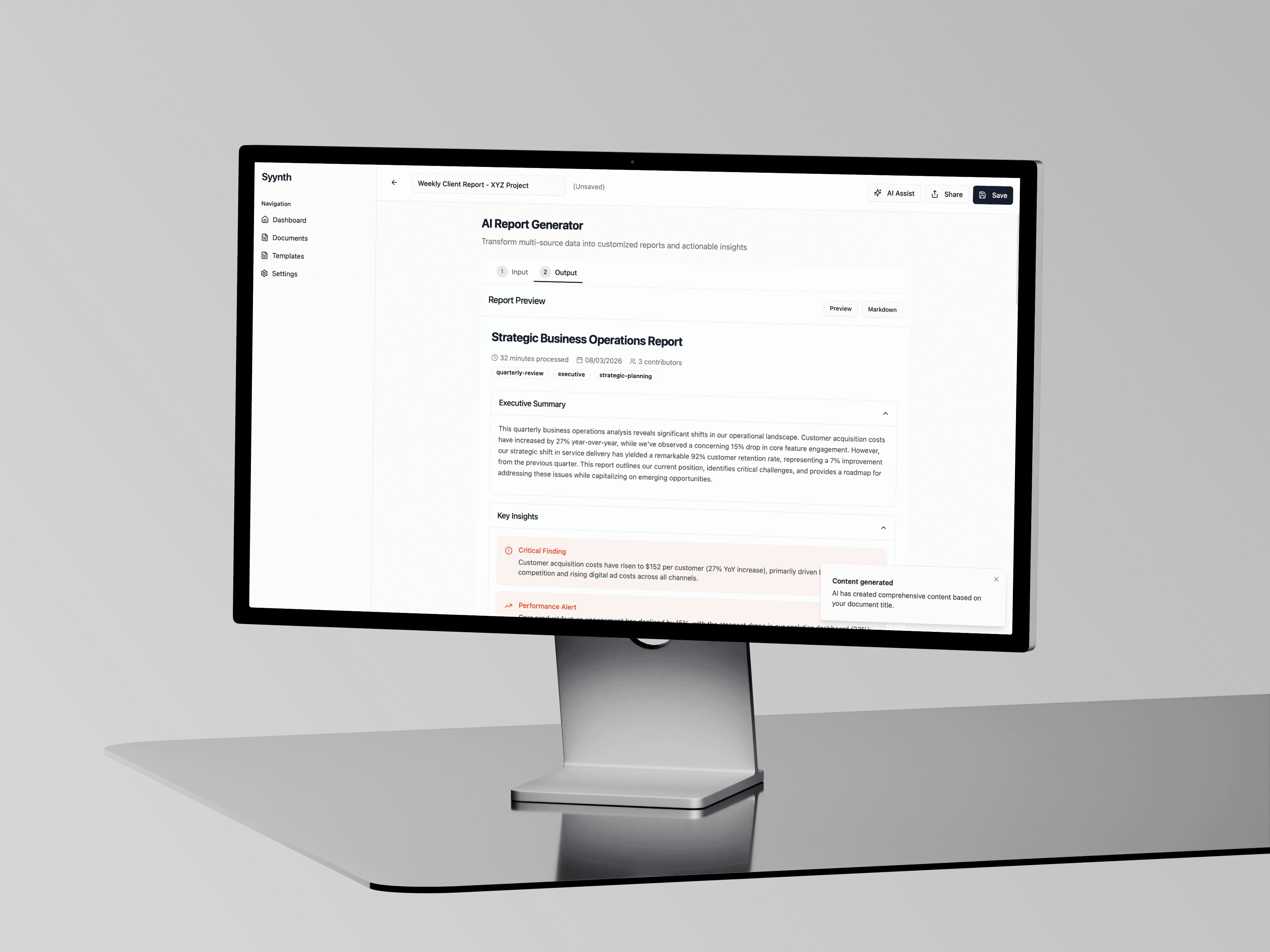
During the initial wireframing phase, the AI generation tool functioned much like a standard chat interface—the user provided a prompt, and the AI returned a wall of text. Early conceptual testing with senior analysts revealed a critical lack of utility.

Mapping the User Flows
To manage the transition from high-level oversight to granular document editing, we mapped fluid user journeys that kept the user in a state of continuous flow.

Interface Solutions & Accessibility
Reviewing dense strategic data inherently causes cognitive fatigue. The interface required a layout that aggressively chunked information. Designing for Rapid Scanning The document editor utilises extreme progressive disclosure. By placing sections like "Executive Summary" and "Key Insights" inside collapsible accordions, the user is protected from visual overwhelm when the AI generates a multi-page report. The split-screen layout used for the AI Assistant sidebar ensures that the user never loses context of the main document while reviewing the AI's structural suggestions.