
Recruitment agencies have a presentation problem that nobody talks about. The sourcing is hard, but the client handoff is where relationships break.
An agency finds the right candidate. They know it. But they're presenting that person through a generic third-party platform with someone else's logo on it, in a format that was designed for everything and optimised for nothing. The candidate looks like a data row. The agency looks like a middleman. The client makes a slower decision than they should.
That gap, between internal pipeline and external presentation, was where TalentFlow began. But it wasn't the only thing wrong.
The Manual Sourcing Bottleneck: Recruiters were spending hours every day cross-referencing static CVs against complex job requisitions by hand. Years of this. Nobody had automated it in a way recruiters actually trusted.
The Black Box Problem: The tools that did offer matching gave a percentage and nothing else. A 74% match means nothing if you don't know what it's measuring. Recruiters ignored the scores and went back to manual review.
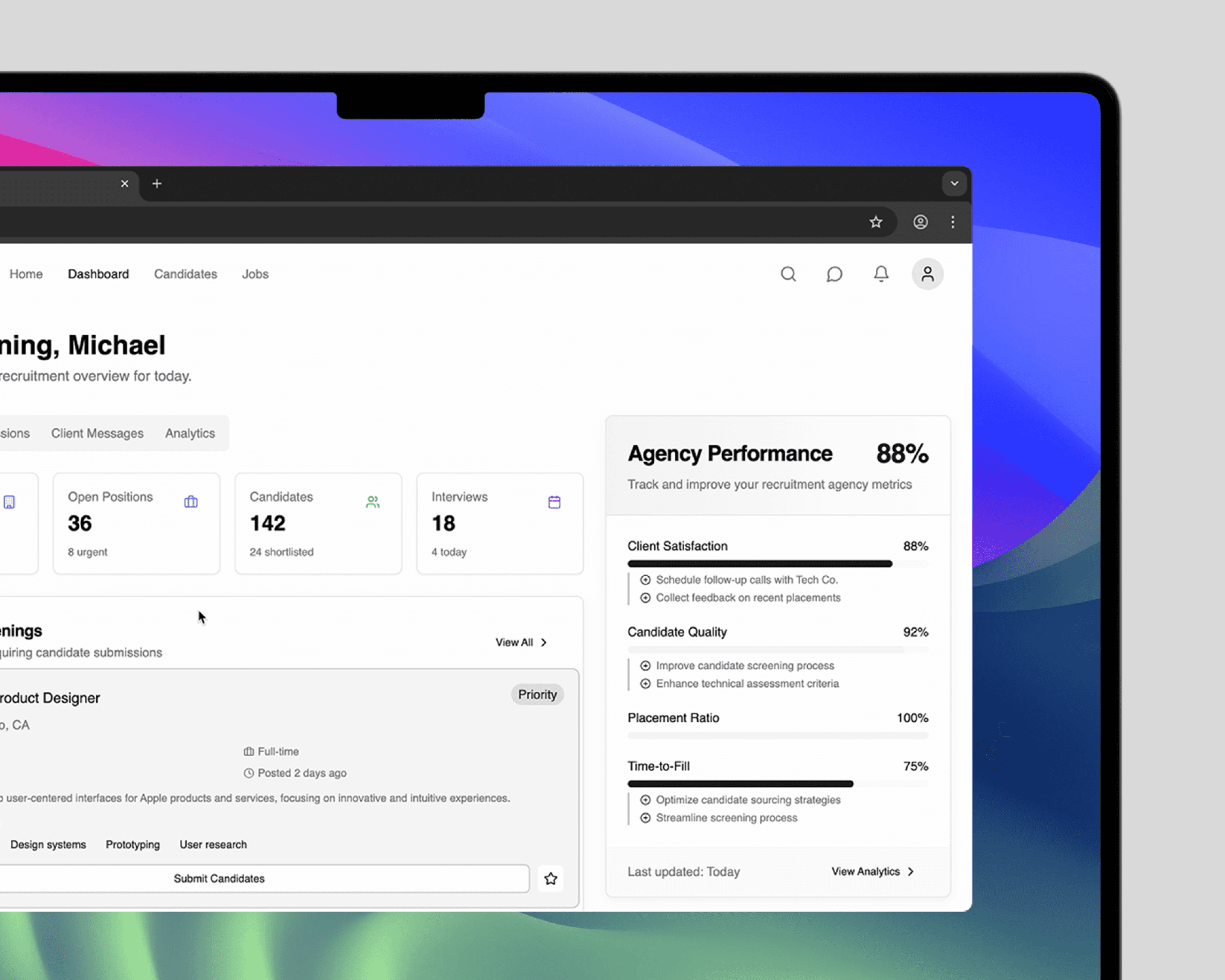
Brand Dilution: No existing tool offered white-labelling. Every candidate shortlist went to clients through a third-party interface. The agency's identity was invisible at the most important moment of the relationship.
Three personas, three completely different relationships with the same data
Before any UI work, we mapped three distinct users and what success looked like for each of them at the end of a working day.
The recruiter needs to move fast. They're scanning profiles, qualifying candidates, composing outreach messages, updating pipeline stages. Speed and density are their primary concerns. A recruiter who has to click through four screens to get to a candidate's key skills will find a workaround or leave the platform.
The agency director needs visibility without noise. They're not working the pipeline themselves, they need to see where things are across multiple roles and clients at a glance, spot problems before they become crises, and report upward with confidence.
The candidate has the most fragile relationship with the platform. They never chose to be in it. Their professional representation depends entirely on how well their information is surfaced. Getting their profile layout wrong isn't a UX problem, it's a professional dignity problem.
Those three frames shaped every hierarchy decision in the interface.
The candidate card was redesigned four times before it worked
The core unit of the platform is the candidate card, the compressed view a recruiter sees when scanning a shortlist. Getting that card right meant understanding what a recruiter actually looks at in the first two seconds and what they look at only if something catches their attention.
First pass: too much information, no clear hierarchy. Recruiters' eyes scattered. Second pass: too sparse, key skills hidden behind a click. Third pass: better density, but the AI match score was presented as a single number with no context, testers ignored it. Fourth pass: the Explainable Match. Skills Match, Experience, and Culture Fit as separate confidence bars, each one derived from explicit criteria from the job requisition.
That last change was the breakthrough. Recruiters stopped ignoring the score because they could now see what it was actually measuring. More importantly, they started using it as talking points with clients: "The AI flagged her Design Systems experience as a 94% match against your brief" is a different conversation than "she scored 74%."
The white-label system was built token-first
For TalentFlow to work as a genuinely white-label product, the visual system had to be entirely neutral at its base. No opinionated accent colours, no brand-forward components, nothing that would fight with an agency's identity when applied on top.
We built the component library around design tokens, every colour reference pointing to a variable rather than a fixed value. An agency uploads their logo, sets a primary and accent hex, and the interface recolours instantly without breaking contrast ratios or accessibility standards. We tested this against twelve different brand palettes including some difficult ones: a neon green primary, a near-black accent pair, a pale beige background. The system held up across all of them.
The candidate profile view under white-label needed particular attention. It's the screen a client sees when evaluating shortlisted candidates, effectively the agency's pitch document. Layout, typography hierarchy, and the way skills are presented all needed to feel polished enough to sit in a boardroom context, regardless of which agency's branding was applied.
Outreach was a separate problem hiding inside the platform
Recruiters spend a significant portion of their day writing outreach messages to candidates. Most of them follow the same structure but with enough personalisation to not feel templated. That's a slow, repetitive task that compounds across a high-volume pipeline.
The automated outreach suggestion engine was scoped later in the project, but ended up being one of the most-used features in testing. Given a candidate profile and a job requisition, it generates a personalised opening message that references specific skills and experience rather than generic flattery. Recruiters edited roughly 40% of suggestions before sending. The other 60% went out as generated. That ratio was considered a strong result.
The lesson: AI in professional contexts has to earn trust before it gets autonomy
The Explainable Match was the right call not just for usability but philosophically. In recruitment, a wrong recommendation has real consequences for real people. Showing the reasoning, making the AI's logic legible, meant recruiters could catch errors and override them confidently. It also meant they could advocate for the AI's recommendation when they agreed with it.
Opaque automation in a high-stakes professional environment gets rejected, not adopted. Transparency is what turns a tool into a trusted colleague.