
The AI skills gap is real. The credentialing system meant to close it is broken in a way that makes it worse.
Hiring managers don't trust course certificates. Learners know this, which is why they feel deflated after completing a course they worked hard for. The certificate goes on LinkedIn. The recruiter scrolls past it. The gap between "I learned this" and "I can prove I learned this" remains exactly as wide as before.
We'd seen this pattern from both sides. Hiring managers described ignoring platform badges entirely. Self-taught professionals described finishing courses and still not knowing how to answer "can you demonstrate this?" in an interview. The market for AI education was exploding and simultaneously failing to produce credible evidence of competency.
The Verification Deficit: A certificate that requires only video playback to earn is not evidence of anything. Employers know it. They just don't have an alternative to point to.
The Translation Gap: Learning a skill and being able to articulate that skill professionally are different capabilities. Most platforms helped with the first and ignored the second entirely.
Passive Interface Design: The worst thing a learning platform can do is design itself to feel like entertainment. Endless resource lists, autoplay videos, sidebar navigation full of courses. The interface trains learners to consume passively, which is the opposite of what competency development requires.
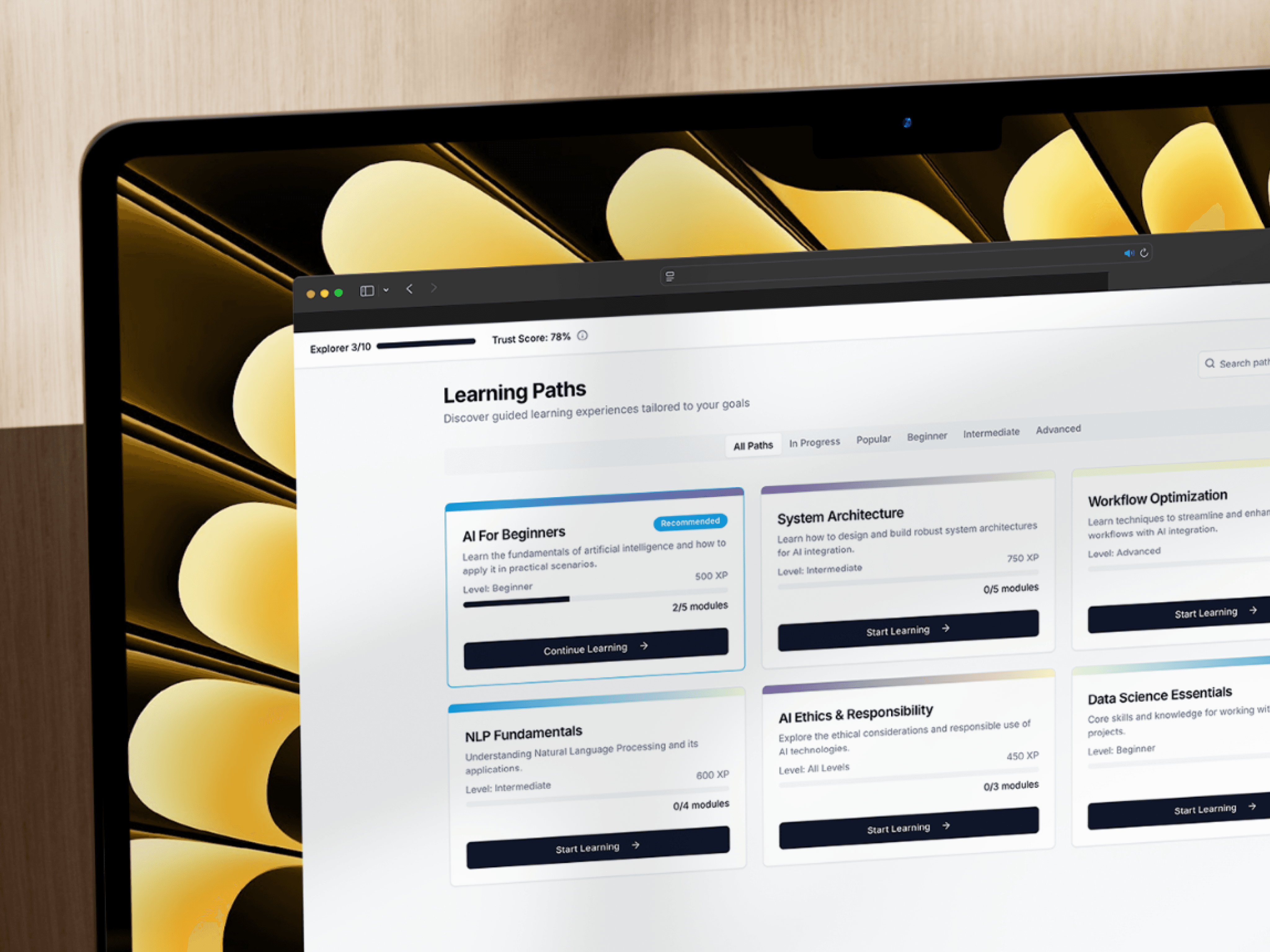
The Trust Score was the concept everything else had to support
Before any screen design, we needed to resolve a conceptual question: what does verified competency actually look like? Not the certificate, the underlying signal that makes the certificate mean something.
The Trust Score is an algorithmic measure that builds through active completion, not passive watching. You can't earn XP by finishing a video. You earn it by demonstrating understanding, through exercises, applied projects, assessments that require producing something rather than selecting an answer. The score compounds across every module completed, creating a cumulative professional reputation rather than a collection of isolated badges.
That distinction, cumulative vs. isolated, was the design brief in one word. Everything in the interface had to reinforce the sense that learning here builds something durable, not just marks things as done.
The learning environment was stripped to almost nothing on purpose
The active module view has no sidebar. No recommended courses. No progress summaries from other modules. Nothing that isn't directly related to the content in front of the learner.
That level of visual restraint was a deliberate fight against the patterns that dominate the e-learning space. The ample white space, the high-contrast typography, the muted palette, none of it is aesthetic preference. It's cognitive load reduction. Dense technical content like system architecture or prompt engineering needs the learner's full attention. The interface should make that easier, not compete with it.
Progress tracking lives in a subtle top-bar indicator, Explorer 3/10, 0/5 Complete, always visible but never demanding attention. You can check where you are without the interface making you feel guilty about where you aren't.
The public/private toggle was the feature that made it a portfolio tool
A persistent toggle in the dashboard lets users switch between private learning mode and public portfolio mode. Same data, two completely different presentations. In private mode, it's a personal study environment. In public mode, it's a verifiable portfolio that a recruiter can link to directly from a job application.
The public view surfaces the Trust Score prominently, lists verified skills with the specific competency areas each one covered, and shows active learning paths in progress, signalling not just what someone knows but that they're continuing to develop. That "currently learning" signal tested surprisingly well with hiring managers. It communicated growth mindset in a way that a static certificate cannot.
The toggle itself needed to be unambiguous. Users were anxious about accidentally making their private progress public or sharing something incomplete. We went through several iterations, a switch, a button, a tab pair, before landing on a clearly labelled persistent toggle with a distinct colour state for each mode. The anxiety in testing dropped immediately.
Gamification has a credibility ceiling that most platforms hit and ignore
Early in the project there was a push toward more aggressive gamification, leaderboards, streak counters, daily challenge notifications. We built and tested some of it. The feedback was consistent: it felt juvenile. People learning to qualify for senior technical roles don't want to feel like they're playing Duolingo.
The XP system that remained was deliberately understated. No animations celebrating level-ups. No confetti. Points accumulate quietly and feed the Trust Score without fanfare. The accomplishment is the score, not the earning of it.
The balance we were looking for: engaging enough that progress feels tangible and motivating, credible enough that a hiring manager would take the score seriously as professional evidence. Too far in either direction and the whole concept fails.
What the project clarified: active validation is the only path to institutional trust
The Trust Score works because it can't be gamed by passive consumption. That property, resistance to gaming, is what makes it credible to employers. Building that resistance into the system architecture early, rather than as a bolt-on, was what made the platform something genuinely new rather than another badge generator with a better UI.